Blog
Taste the Rainbow: Picking the Perfect Color Scheme for Your Portland Kitchen
June 19, 2013
|
|
We Portlanders are not known for shying away from bright, funky color schemes in our homes. In fact, we’ve seen plenty of homes that have different brightly colored paint jobs in each room! But when it comes to the kitchen, specific colors can cause different reactions among your friends, family, and dinner guests. The following is a little information about roomcolor you need to know if you're planning on building or remodeling your Portland kitchen.
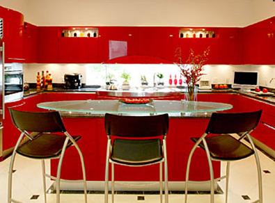
Red
Red is a passion color and creates a lot of energy in a room. In a kitchen, red can create a livelier atmosphere and get everyone’s blood pumping. In fact, red has been shown to speed heart rate and raise blood pressure. If you’re looking for an exciting, high-energy feel for your Portland kitchen, red might be right up your alley. If not, go more a more muted tone.
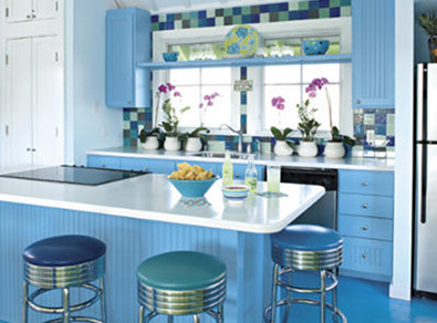
Blue
Blue rooms produce pretty much the exact opposite affect as red rooms. Blue rooms lower blood pressure, reduce stress, and create an overall relaxing feel in a room. Many people choose blue color schemes for their kitchens because they want to feel relaxed and tranquil while cooking. However, if you have a hard time mustering up the energy to prepare a full meal, adding blue to your kitchen might make things worse.
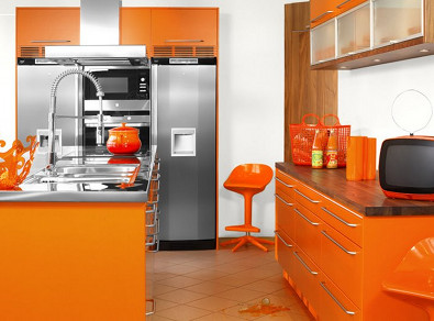
Orange
Orange rooms are all about energy. Commonly used in gyms and offices, the color orange is said to increase energy levels and even improve lung function. Like red, using orange in a kitchen is a good idea only if you want your kitchen to be a vibrant, lively room. If not, move along.
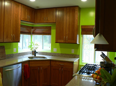
Green
Green is considered to be the most restful color for the eye and complements pretty much any room in the house. Like blue, green is known to produce a calming and relaxing effect. Green can have a cooling effect on a kitchen, which makes it great for kitchens in hot climates (but not so great for kitchens in the rainy Pacific Northwest).
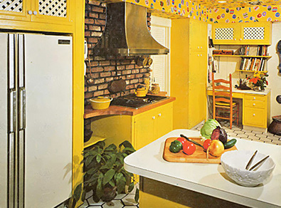
Yellow
A classic kitchen color choice, yellow evokes the sun, making a room feel warmer and happier. It’s not as aggressively upbeat as orange or red, nor is it as sleep inducing as green or blue. Watch out overdoing it, though – studies have shown that people tend to lose their tempers more often in rooms with heavy yellow color schemes.
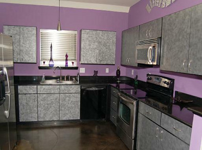
Purple
Purple is a very dramatic, sophisticated color scheme, and is usually reserved for lounges, dining rooms, libraries, and other rooms that require an air of luxury. Purple can also instill trust and respect in its viewers, which might be a good feeling for a kitchen to give off. However, overuse it and you can come across a little high-and-mighty.
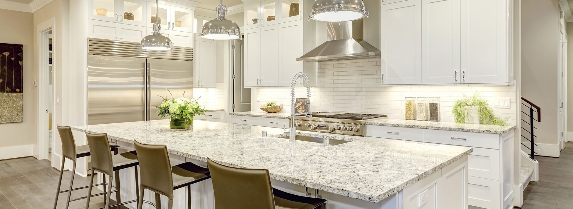
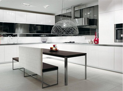
Black/White
Neutral color schemes like black and white are great for any room because they allow you to add and subtract more dramatic design features as you see fit. While we would never suggest painting your entire kitchen black, many decorators suggest using neutral black or white accents to give the rest of the room depth and contrast.
What color is your Portland kitchen? Leave us a comment and let us know! |
Return to Blog Main Page |

![]()
Call for Guarantee & Satisfaction Details.